Showing posts with label The Color Room. Show all posts

Tuesday, August 23, 2011

Road Trip Niagara Falls & TCR#72

So I got some time to play this weekend with some new Jillibean Soup, Apple Cheddar line for an upcoming Scrapjazz.com article and The Color Room's color palette. Here is this weeks tidbit of inspiration from The Color Room:

So I had to dig a little deeper in my stash than usual to come up with the colors but Joy Ride by Cosmo Cricket paired up nicely with bling cardstock and a little Jillibean Soup. I also turned the sketch a 1/4 turn to the left and added extra photos too. Here is the result:

I think it turned out perfect for Gabe's album, a sweet layout for my little cutie. 
Let me know what you think!

Saturday, August 6, 2011

The Color Room Palette #69

Just wanted to share the layout I did for last weeks palette at The Color Room. The sketch this week is perfect for summer and the palette is too! Here is the inspiration:

So I took it in my own direction but did stay true to the sketch and colors. I created a layout that features my top 3 dream vacation destinations:
Materials Used: Basic Grey/Recess; Bazzill Swiss Dot/White; Jillibean Soup/White Corrugated Alpha- #3 & brown mini kraft alphas; Making Memories Alphabet Stickers/Glitter Bling & Shimmer Alpha; Hero Arts/Stitching stamp; Art Warehouse-Ribbons & Lace/Stripe line stamp; Stampin Up Ink/Chocolate Chip & Sahara Sand; Fiskars border punch/Upper Crest

We can all dream right?! Ahhh to float down a street in Venice, to snorkel the Great Barrier Reef or explore the art of Paris....  maybe someday. I used lots of stamping, a border punch and paper pieced the  sunburst. I was happy with the result, let me know what you think! In fact I am going to make a coordinating page with my top 5 U.S. vacation destinations. So stay tuned for that one.

Have a fantastic weekend, we are anxiously awaiting the arrival of Scott's parents! Looking forward to time with family and a trip to Niagra Falls!

Monday, July 25, 2011

The Color Room Challenge#68

So I got some time yesterday to create a layout to play along at the Color Room. They come up with the coolest color palettes and inspiration and so I felt, inspired. Here is the palette/inspiration sketch from "Her Room":


So here is my interpretation of it, I kept the sketch intact and added a lovely photo of my daughter and her bff. There's some fun masking, stamping and lots of layers! My favorite part is how the bottle caps combined with some vintage pearl buttons look like sweet little cupcakes!
Here are some close-ups:


Materials Used: Studio Calico/Elementary (base), SEI, Jillibean Soup/Kraft, My Minds Eye/Life Stories, Jillibean Soup/Corrugated Button Flowers (as masks), Making Memories/Animal Crackers velvet brads, Fiskars/effervescence & apron lace border punches, Flower  punch, E. Prima/pearls, Maya Rd./Maya mist-brown, pink ribbon, Scenic Route/gold letter stickers, vintage trim, vintage buttons, vintage bottle caps

This color combo makes me happy, makes me think of a bakery and pastries, lol. 
Let me know what you think of my latest. 
Have a great week!


Monday, June 20, 2011

The Color Room #63 Challenge

Hey all, I got a chance to do the Color Room Challenge this weekend and used some fabulous new Webster's Pages Yacht Club collection pieces. Just wanted to share, here is this weeks palette inspiration:


This is my interpretation of it:
Here are some close-ups:


So in love with this line from Webster's Pages, lots of fun to work with!  If you  are interested in getting weekly inspiration from The Color Room follow this link: http://thecolorroom.ning.com/ If you are interested in more Webster's Pages inspiration then go to their website InspireMe, There is lots going on there with a brand new Celebrate line premiere with games and prizes!
Let me know what you think of my latest creation!

Monday, March 21, 2011

The Color Room- 50th Palette Celebration

Over at the Color Room blog they are having a 50th Palette Celebration! There is a fantastic, and long blog hop- but I guarantee you won't be disappointed by what you see along the way. Those are some amazingly talented ladies, and they share tips and techniques as well as their works of art. So please go check it out, they are one of my favorite sites for inspiration.

Here is this weeks Palette and sketch (there is also a card sketch for anyone interested):

And this is my interpretation of it, Titled- "Ticket to Mischief" :)

Materials used: Basic Grey/Wander; My Minds Eye/Ooh La La, Alphabet Soup; Crate Paper/Restoration-border sticker; Jillibean Soup/Blue Bakers twine; Vintage buttons, white bazzill cardstock, tickets

Love this photo of Gabe from last year, that look he has on his face- pure mischief! And yes he is that ornery and then some!

Thanks for stopping by would love to know  what you think of this one.


Monday, October 4, 2010

The Color Room - Palette #26

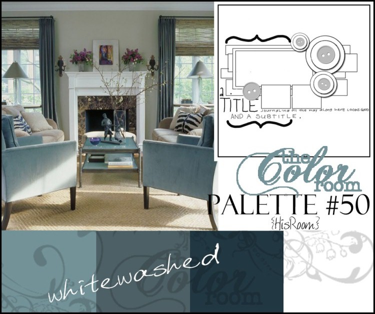
Ok, so I fell in love with the newest color palette and sketch at the color room. Check it out here. Here is the sketch and palette below:

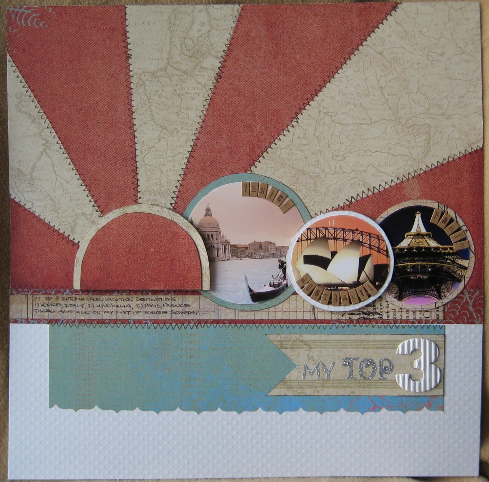
I knew I had to play along and my wonderful husband allowed me to create all day Saturday. I instantly pictured a layout for Aspen celebrating her 15th year. So I called it "Fab 15" and used patterns and a style that I thought Aspen would like. I was right she loves it, it is very much my core shabby chic style and I also love how it turned out.
Materials Used: Coredinations/Red cardstock base; Jillibean Soup/Clove of Fresh Garlic-Pasta Fagioli (red text paper); Pink Paislee/Love Potion-Cupid Collection (red flower & rosebuds); Pink Paislee/Front Porch-Bayberry Cottage (houndstooth); Daisy D's/Pintuck Antique Black (title black mat); Me & My Big Ideas/#5956 CC-170(black flourishes); Glitz Design/Digital CD Season 3-Hot Mama (Zebra & Earrings print); Fancy Pants/Silver Snow-Christmas Magic (gray pattern); Jillibean Soup/Herbed Houndstooth Alphabeans (Title stickers- Fab 15); American Crafts/White Roses & Netting; Queen & Company/White Pearls; Stickles/Red & White Glitter; Jillibean Soup/Red & Black Bean Stalks (black ribbon); White cardstock (journal tags); Computer font Journaling/Rockwell; Unknown/Black flower stamens; Fiskars/Scallop border punch (corners)

So using Aspen as inspiration really allowed for a fresh layout combination. I would have never thought to mix so many patterns otherwise. But I just love how it turned out, especially her beautiful smile. So let me know what you think!